
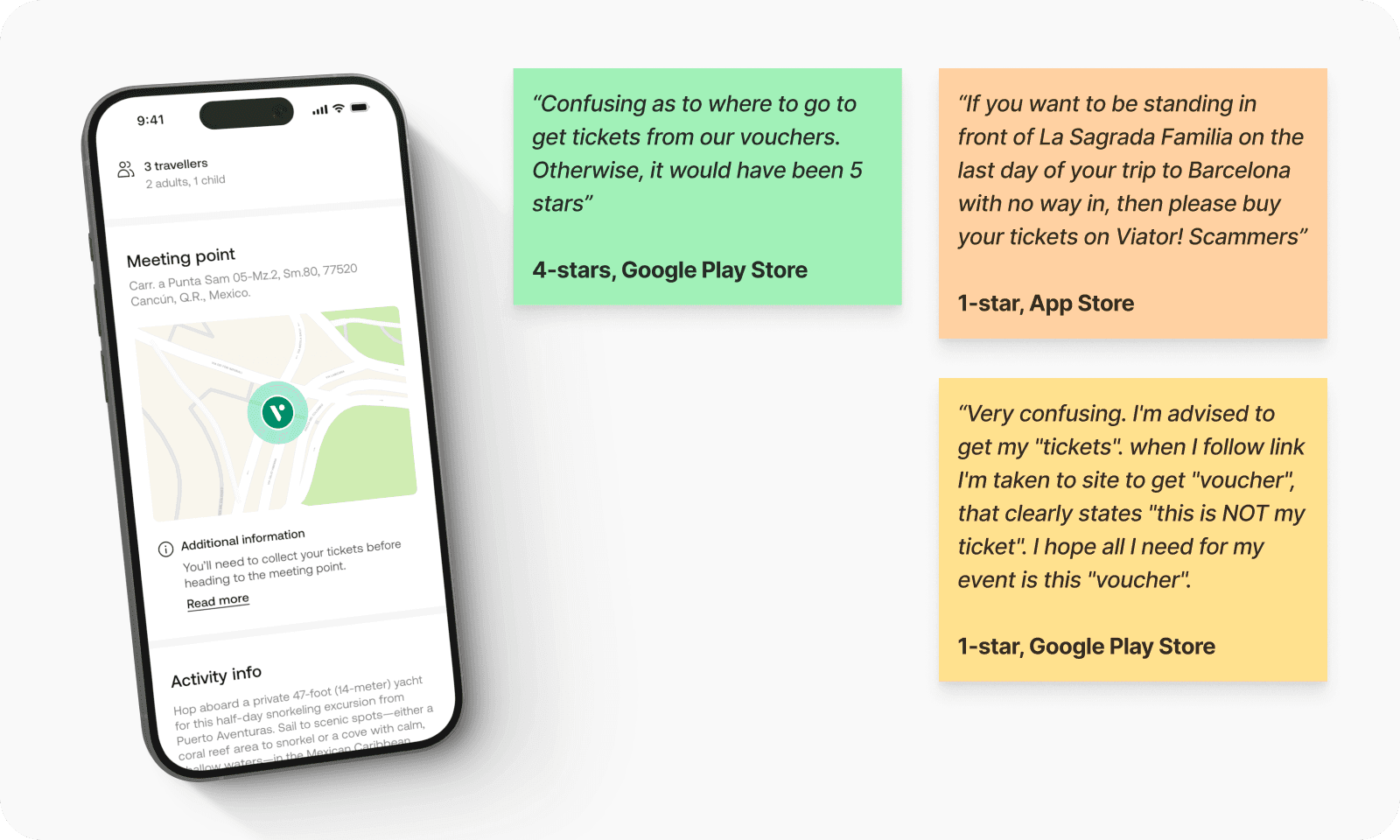
In Q1 2025, I led the redesign of Viator's voucher redemption experience. The existing process confused users and led to support tickets, refund requests, and 1-star reviews. Many travellers mistook the booking confirmation for an entry ticket, only to be turned away at major landmarks.
This project was about more than UI fixes. It was about restoring trust, reducing friction, and creating a clearer handoff between booking and experience.
Contribution
Product design
Product strategy
User research
Team
1x Product Designer
1x Product Manager
1x User Researcher
1x Data Analyst
2x Engineers (iOS & Android)
Company
Viator
Process
Understanding the problem
I reviewed ticket-related complaints across reviews, support logs, and user research. A pattern quickly emerged: travellers didn’t realise Viator vouchers weren’t entry tickets. The redemption info was buried, the language unclear, and users often found out too late – at the gate.
Mapping the pain
Data backed up the friction:
Vouchers accounted for 12.4% of bookings (~$56.8M/year)
Ticket issues triggered 7.1% of WhatsApp chats, 5.1% of calls
Reviews mentioning tickets averaged just 2.3 stars
Reframing the experience
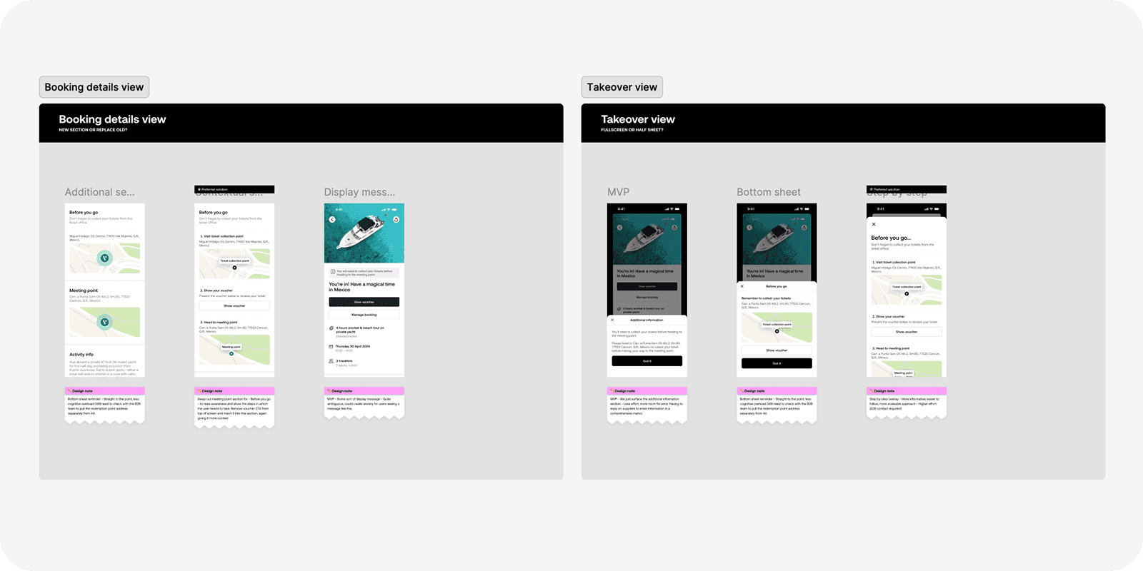
I audited the flow and benchmarked competitors. I explored ways to surface redemption instructions earlier and make them impossible to miss – icons, clearer steps, and location-specific cues made the flow more intuitive.
Solution
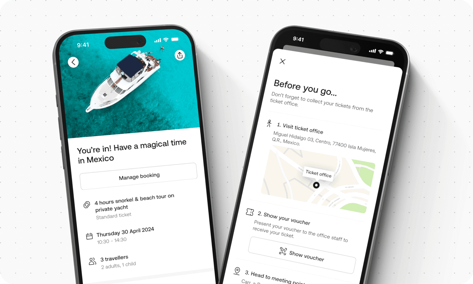
I redesigned the voucher redemption flow to be more intuitive and informative. Key changes included:
Introducing clearer language around the difference between a voucher and a ticket
Replacing vague terms with step-by-step instructions, paired with icons and visual cues
Adding location details and redemption context earlier in the booking experience
Ensuring the redemption steps were consistently styled and positioned across the app
These updates helped reduce last-minute confusion and made the process feel more trustworthy.
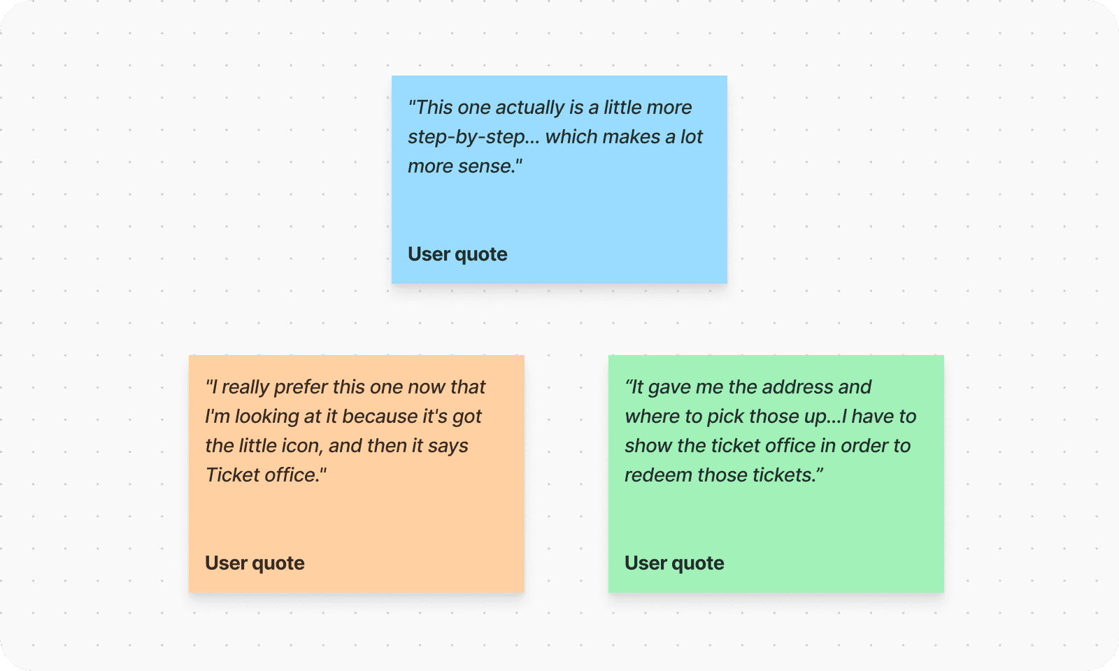
Testing comprehension
Prototypes were tested in moderated sessions. Users responded well to the structured layout and visual clarity:
– “This one actually is a little more step-by-step... which makes a lot more sense.”

Outcome
The new flow shipped with dev-ready assets, tracked success metrics, and targeted a measurable drop in support contact and negative reviews.
Support contact down
WhatsApp: 7.1% → 5.4%
Phone: 5.1% → 4.6%
Review uplift (where tickets/vouchers were mentioned)
1-star reviews: 56% → 38%
5-star reviews: 25% → 32%