Over time, Viator's visual identity had grown inconsistent, dated, and cluttered. It lacked confidence. As a result, the product didn’t just look unpolished - it felt untrustworthy. Users may not always articulate it, but they notice when a product lacks taste or coherence. This project was about fixing that.
Alongside another designer, I carved out two weeks to reimagine what Viator could look and feel like if design were treated as a first-class citizen. Not a redesign for the sake of visuals, but a statement of intent: what does a product look like when it reflects care, clarity, and quality?
Contribution
Product design
Product strategy
Team
2x Product designers
Company
Viator
Process
Defining the problem
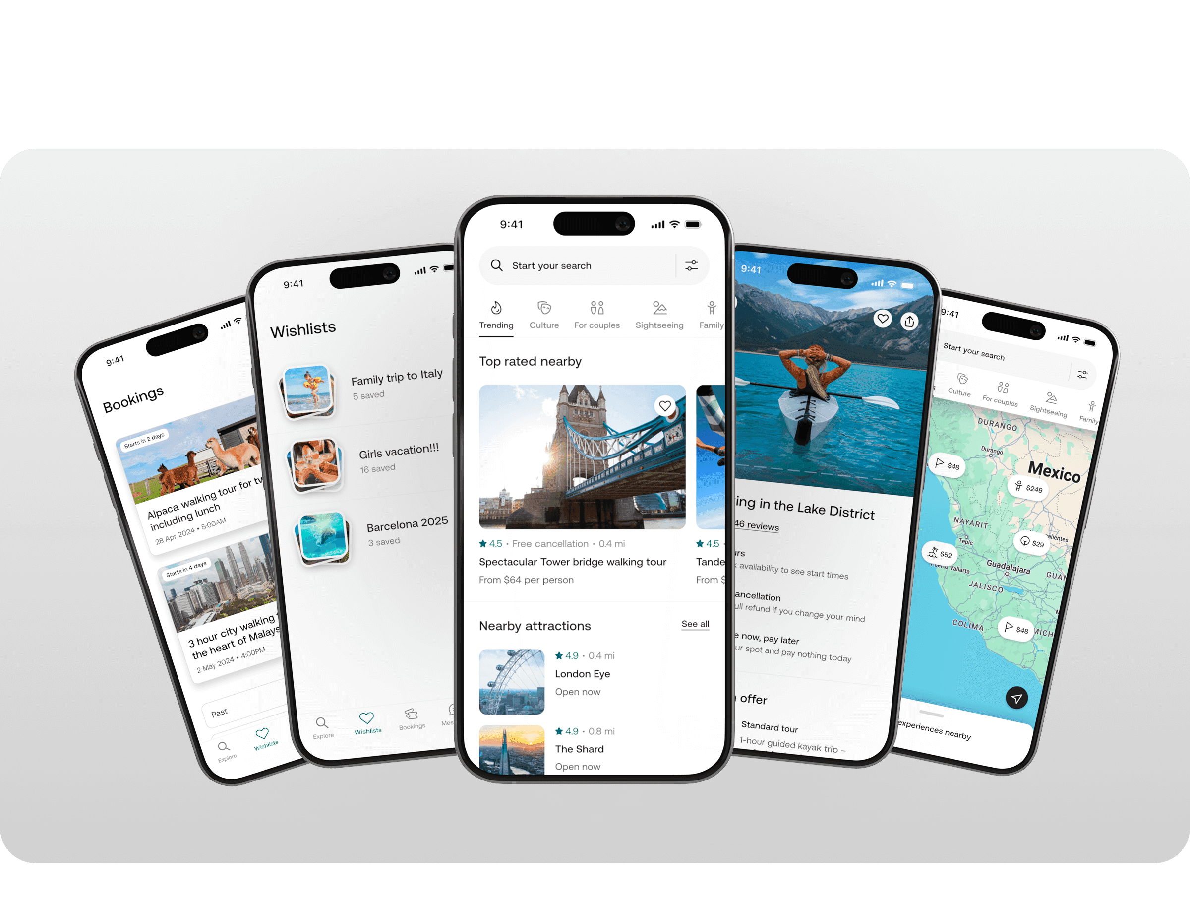
Viator’s product felt visually fragmented. Despite having a design system, it was inconsistently applied and lacked a clear aesthetic point of view. Components didn’t scale well across screens, the UI lacked hierarchy, and there was no shared vision of what “good” looked like. It wasn’t about chasing trends – it was about restoring taste, cohesion, and confidence.
Running a focused design sprint
Rather than a long roadmap initiative, I led a two-week sprint to reimagine what a 10/10 Viator experience could feel like. We split the work into two phases:
Week 1: Definition & Direction
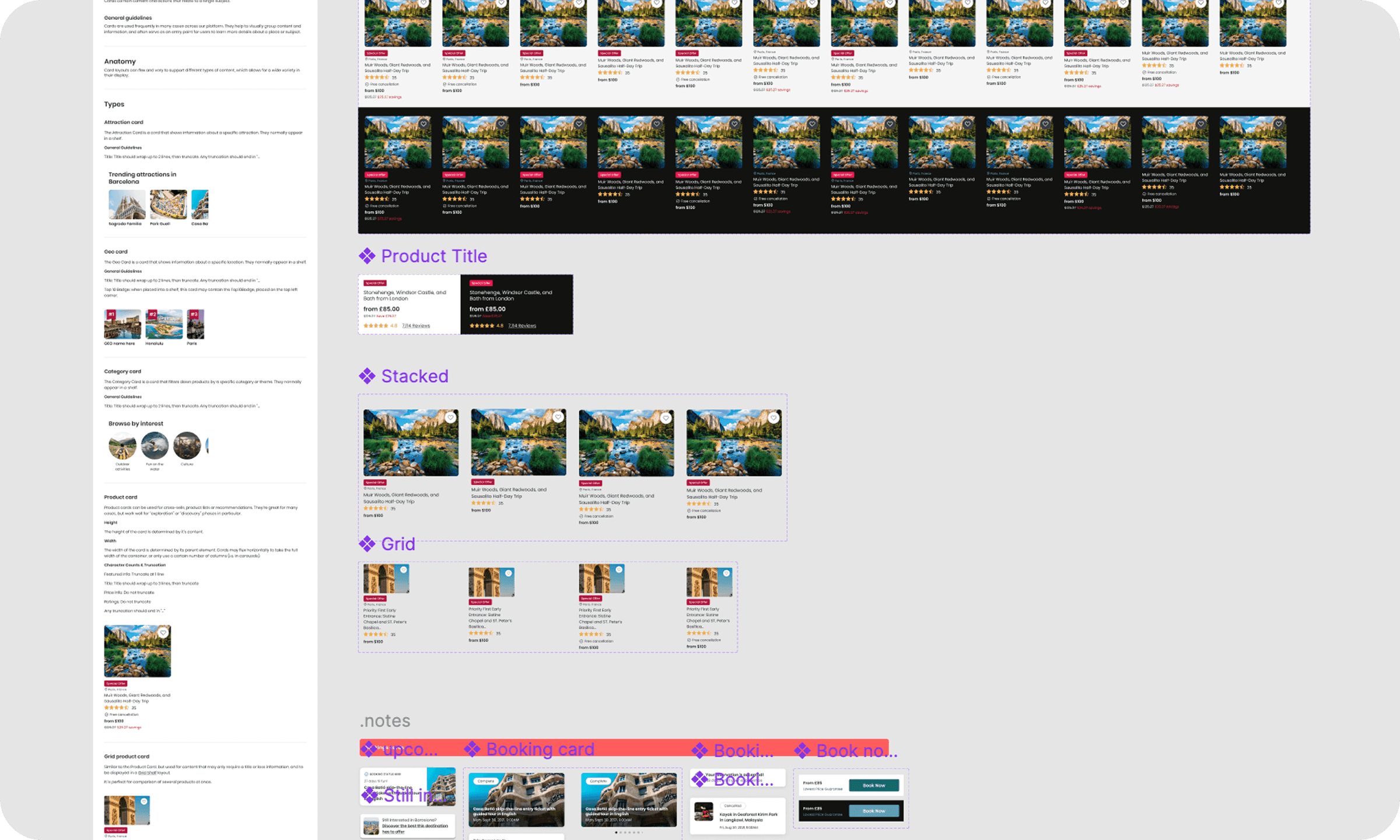
Audited the existing UI and component library
Identified high-visibility inconsistencies across mobile and web
Aligned on principles: clarity, elegance, warmth, utility
Defined constraints – how far we could push the current system
Week 2: Expression & Execution
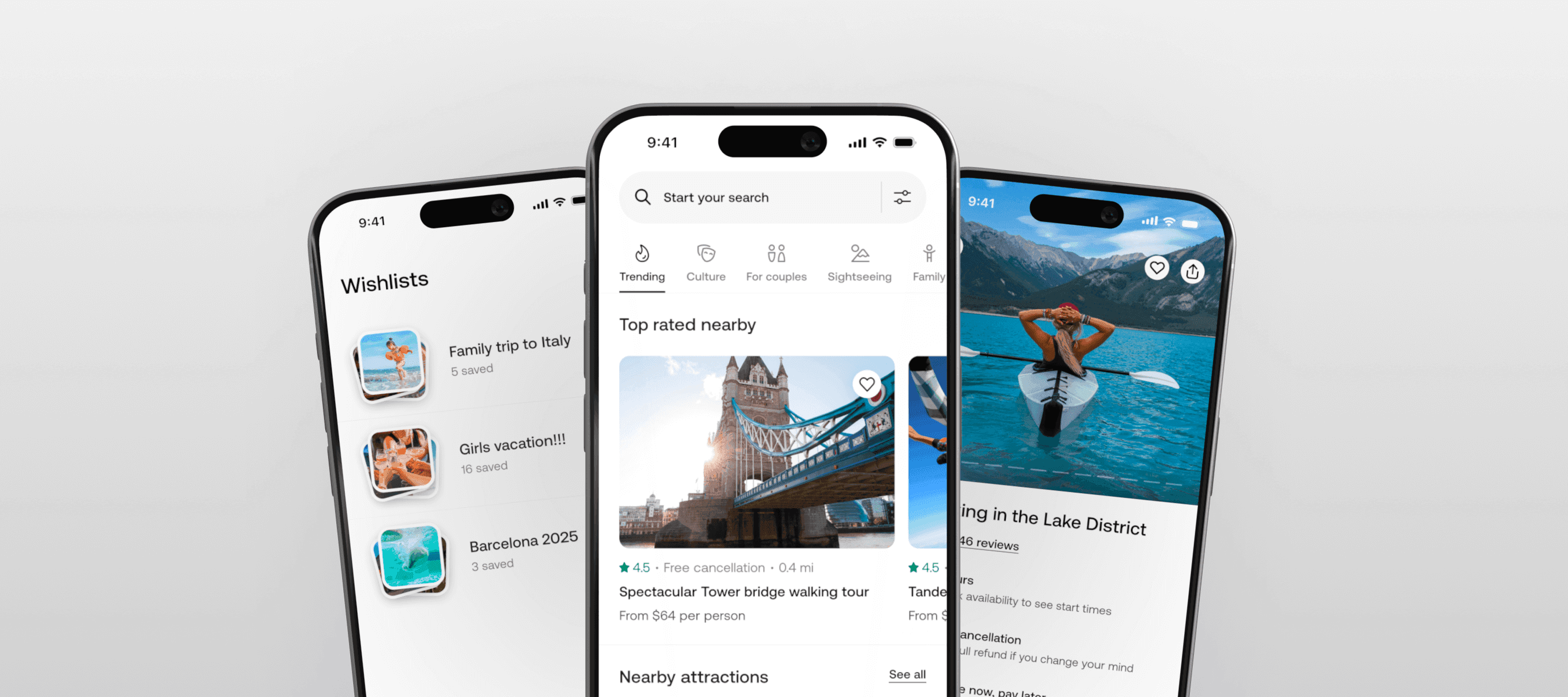
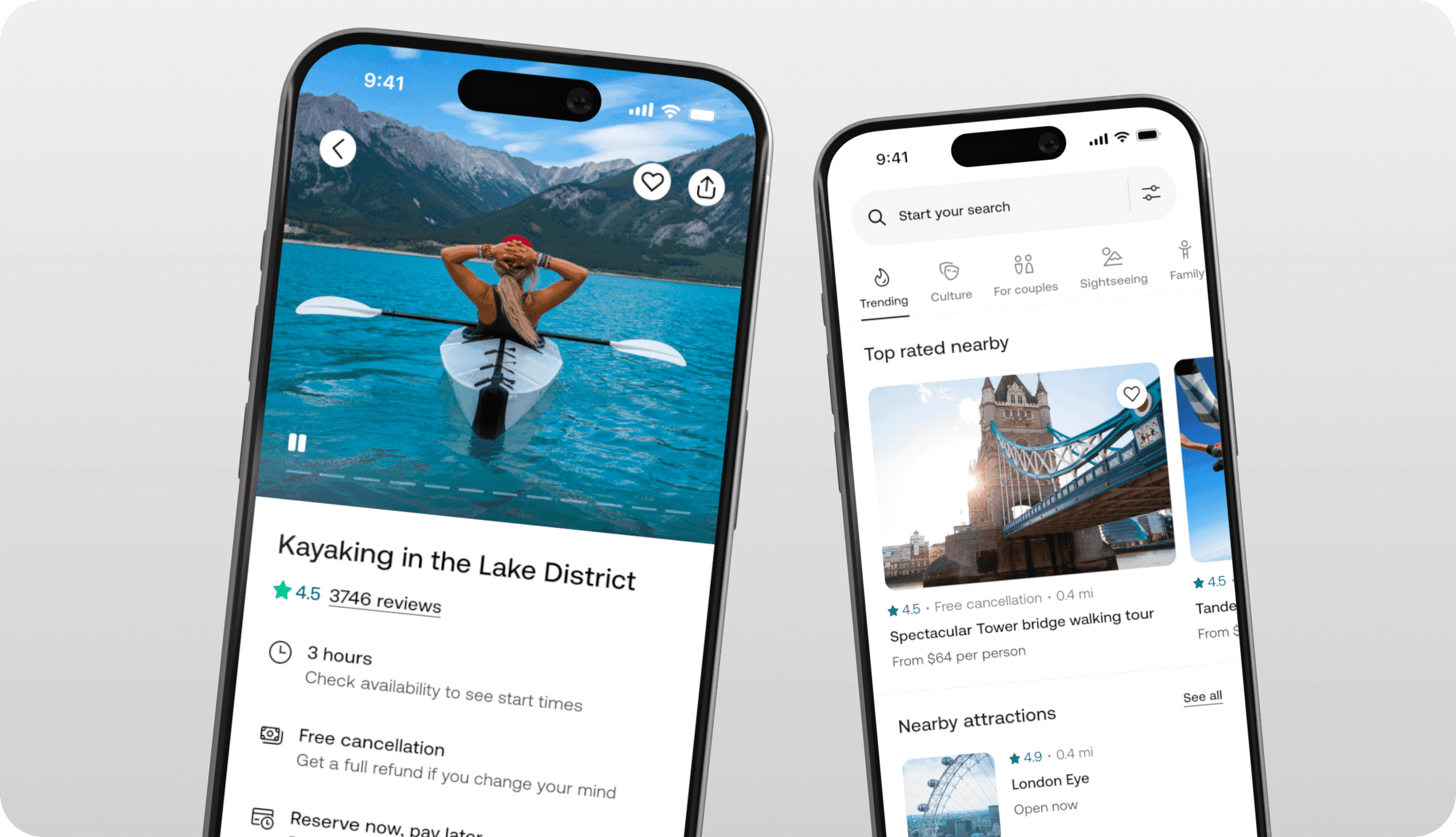
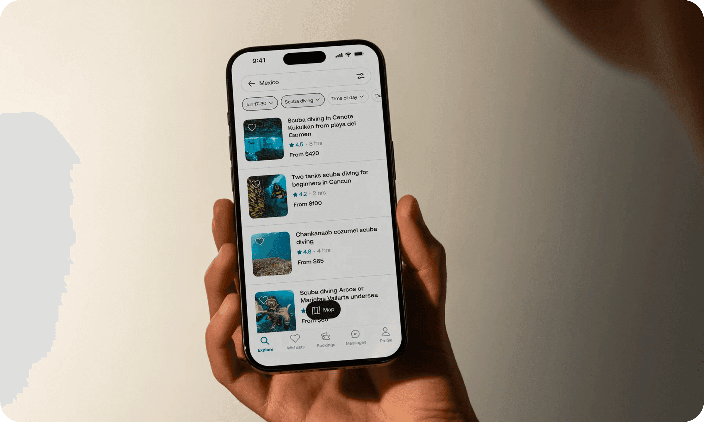
Designed high-fidelity mockups across core flows: discovery, detail, and booking
Refined typography, spacing, colour, and motion
Built rules for content density, rhythm, and breathing room
Prototyped subtle transitions and animations to bring polish and delight
The goal was a considered refresh – one that respected platform conventions, but reintroduced craft and care into the product.
Outcome
The sprint delivered more than just polish – it reset the visual foundation for the entire product.
A clear, opinionated design direction grounded in clarity and care
Refined type scales, spacing rules, and component updates that felt modern and scalable
A shared visual language that aligned designers, engineers, and stakeholders
Animation tokens and prototypes that set the tone for future transitions and interactions
We translated the outputs directly into backlog tickets and began rolling them out across key flows. Gradually, the app started to reflect the new standard – more cohesive, more confident, and unmistakably Viator.
Why it matters
Users don’t click a button and say, "Nice border radius." But they feel when something is off. When design is thoughtful, the experience becomes intuitive. When it’s consistent, it becomes trustworthy.
This project wasn’t about being flashy. It was about taste, trust, and laying the visual foundation for Viator to scale.