
GoHenry is an online app and debit card designed to help children from ages 6 to 18 manage their allowances through intuitive budgeting and responsible spending. They’re on a mission to make every kid smart with money. I worked in the network team who were responsible for everything relatives, payments and social features within the app.
The focus for 2022 was to improve the overall the experience for relatives. We measured our success by two main metrics. The number of payments sent as a gift and the number of users that made a payment in the first 30 days of sign up.
Contribution
Product design
Product strategy
User research
User testing
Team
1x Product designer
1x Product manager
2x Engineers
1x QA tester
Company
GoHenry
Process
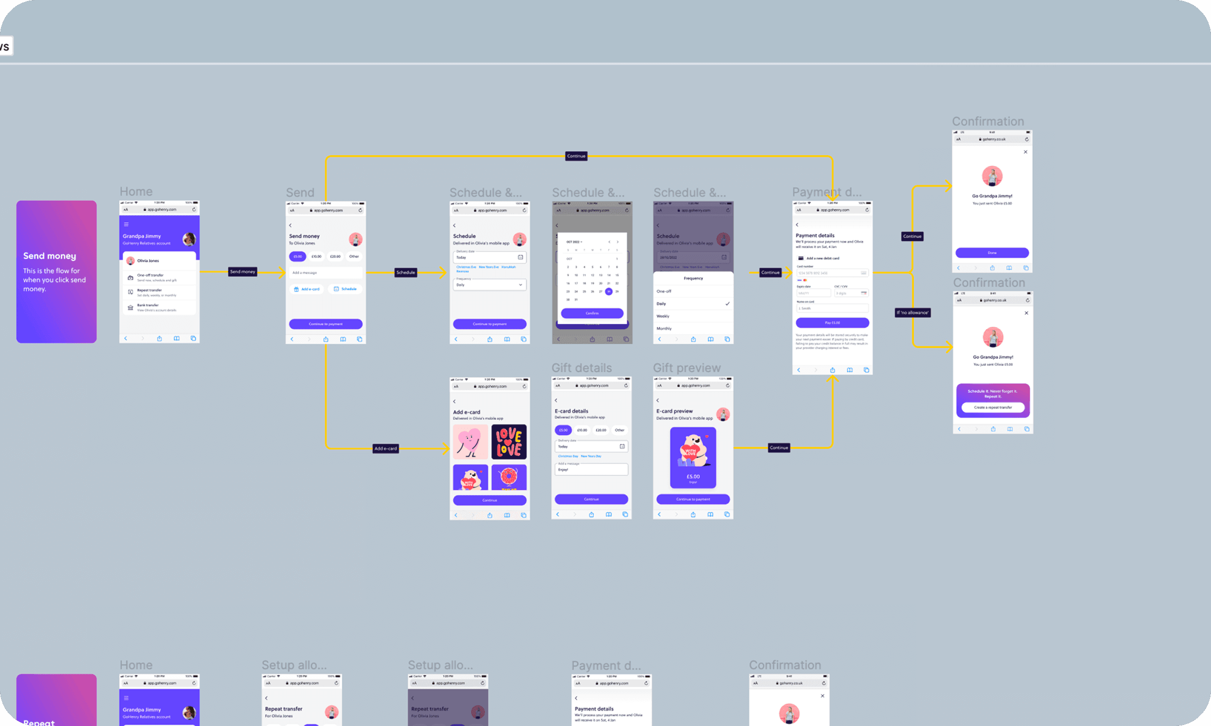
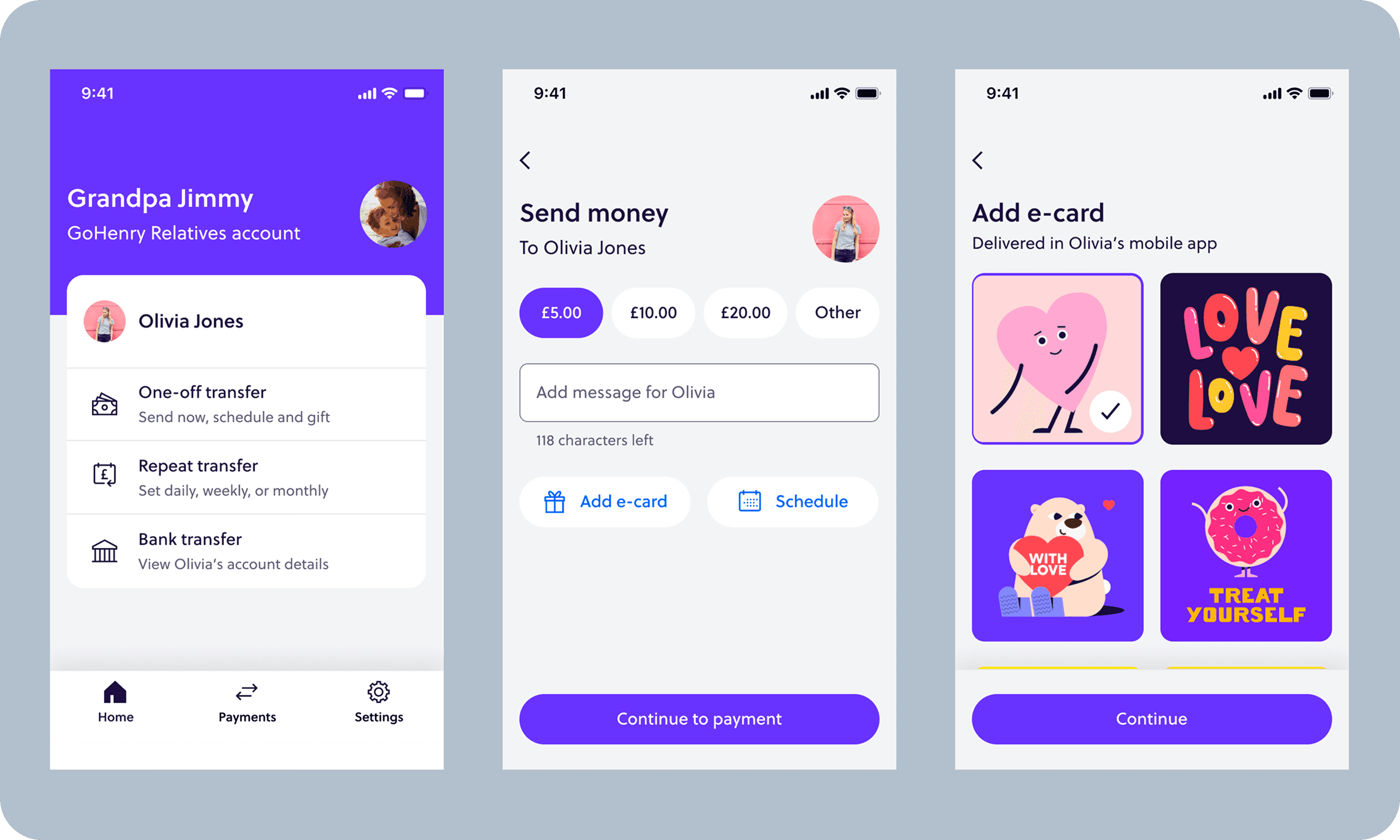
We broke the project down into a few important chunks of work. This included: Updating components to match with current design system, improving on the current user journey and solving pain points and frictions that emerged from user research.From qualitative and quantitative research studies, we found that users who signed up for the first time were initially confused with the different features, resulting to a high bounce rate. The current user journey showed two options to make a payment; Send money & send money as a gift. This confused our older audience as they did not understand the difference between the two.
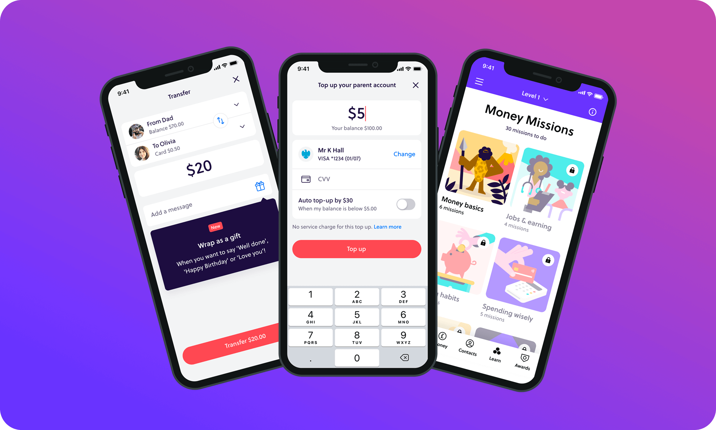
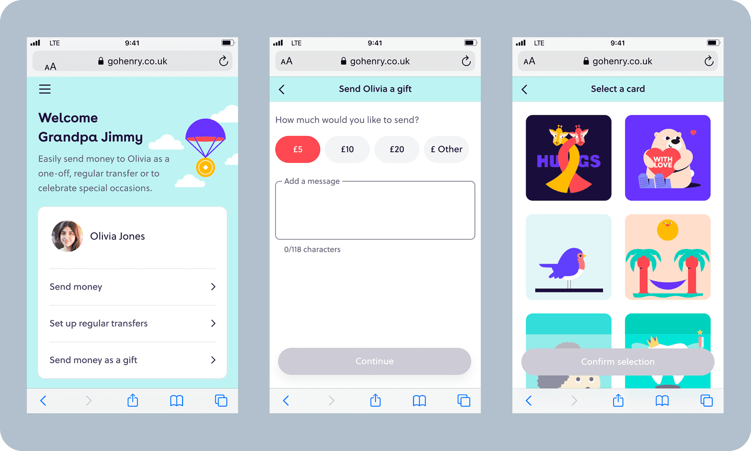
After some workshopping between the team, we came up with a few quick-win ideas to help solve some of these problems. Firstly, we consolidated the two payment options into a one single option named ‘One-off transfer’. We paired this with supporting sub-copy for users to give more context on each action. Icons were then added to each option to make them quicker and easier to understand. The ‘send money as a gift’ feature allowed relatives to simply attach a animated card along with their payment, again this was confusing for our users. We took a leaf out of our competitors book and changed the naming to ‘Add an e-card’. Users were far more familiar with this terminology, also used by Amazon, Waterstones and Barnes & Noble.We also introduced some new features such as recurring and scheduled payments, allowing users to plan ahead for birthdays, holidays and special occasions.
Outcome
After conducting some moderated user tests for several different concepts, we landed on one particular performer. We pushed our new proposition to a live environment to see how it would fair against our control version.
Since the launch, we saw a 7% increase in the number of payments sent as a gift and 3% increase in the number of users that made a payment in the first 30 days of sign up.